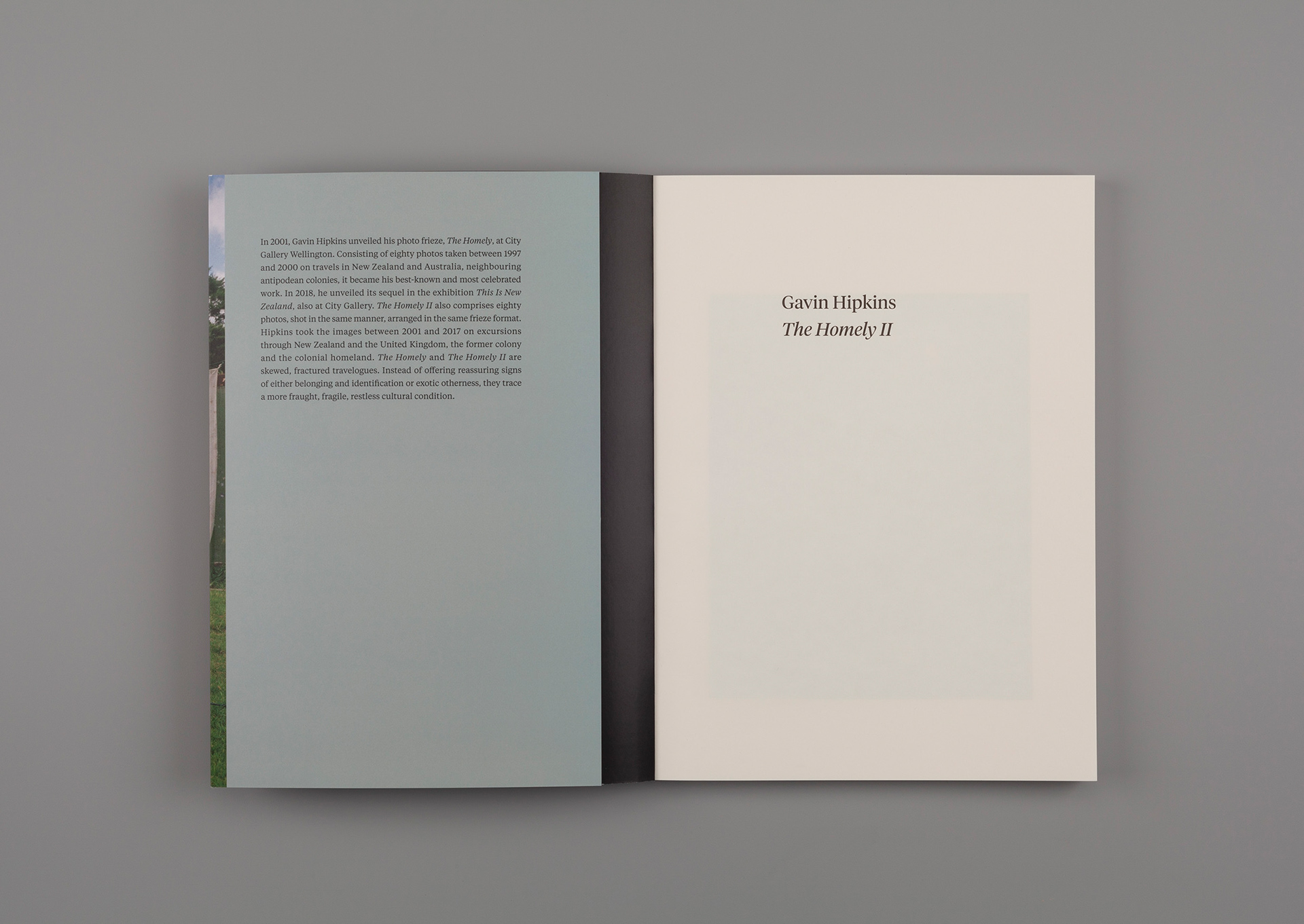
Background
There’s a new imprint in town. Bouncy Castle publishes contemporary-art books. Why did they call it ‘Bouncy Castle’? ‘Because it’s important to defend positions but also to have fun’, explain publishers John McCormack and Robert Leonard.
There’s a new imprint in town. Bouncy Castle publishes contemporary-art books. Why did they call it ‘Bouncy Castle’? ‘Because it’s important to defend positions but also to have fun’, explain publishers John McCormack and Robert Leonard.
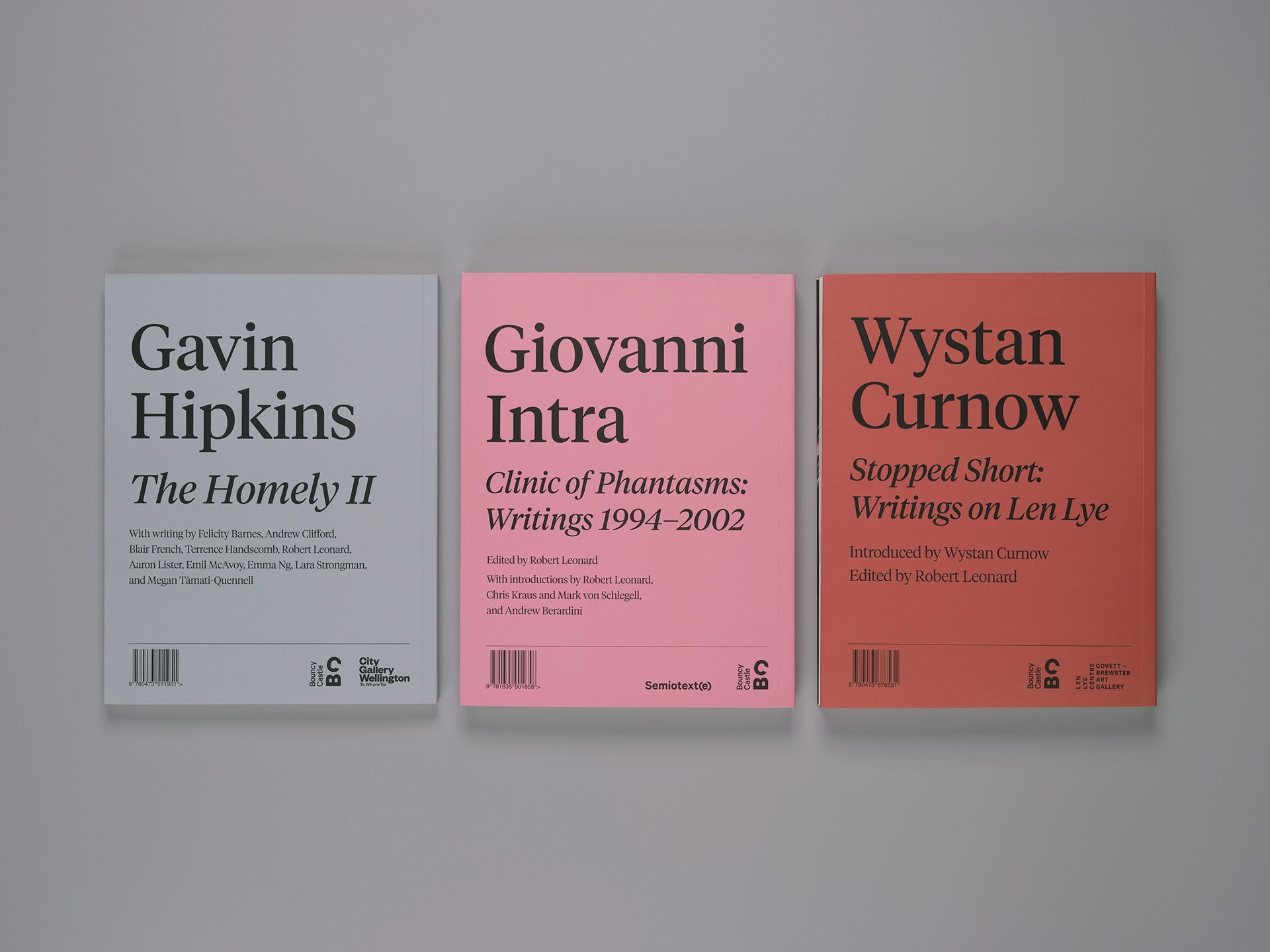
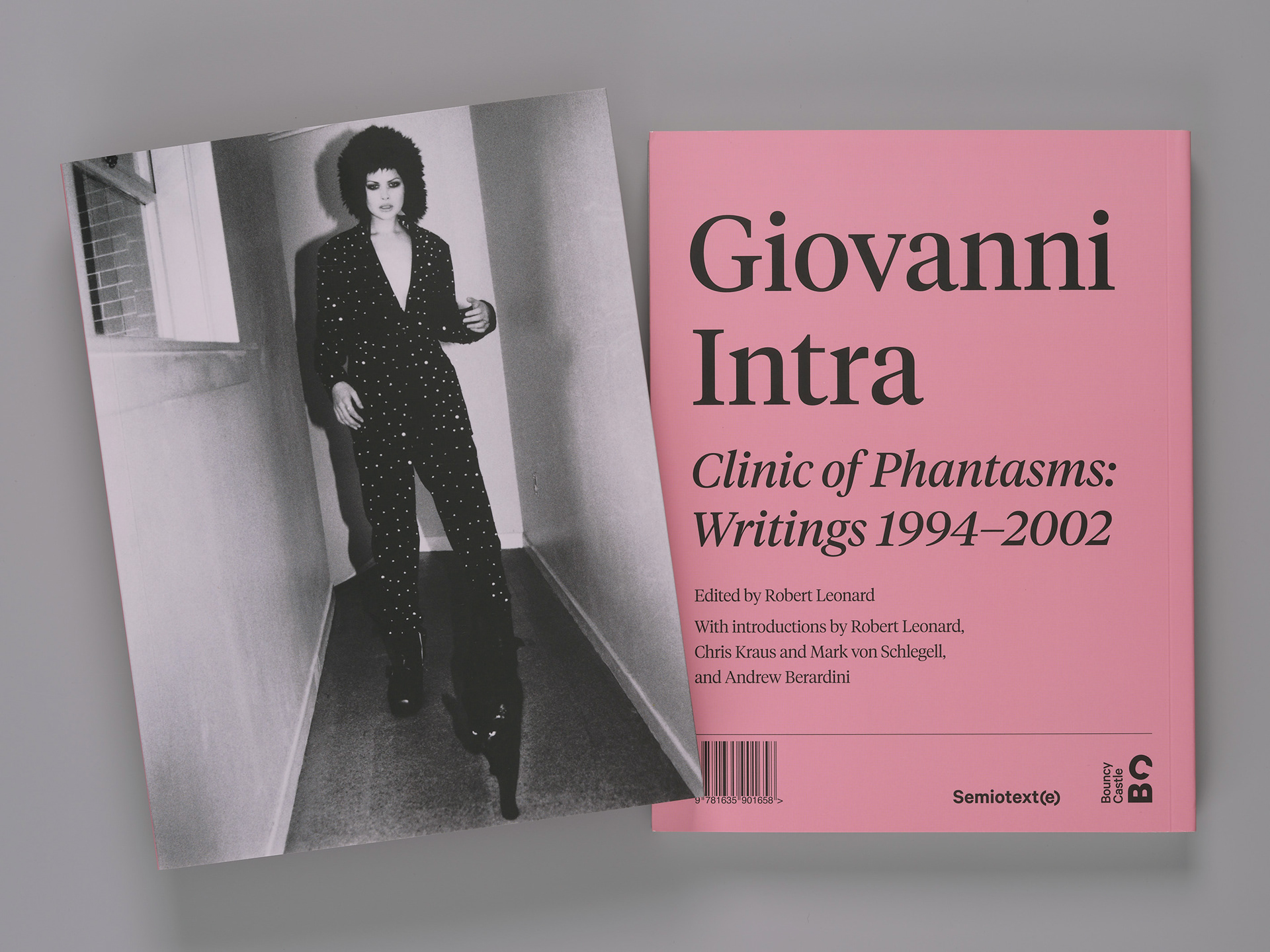
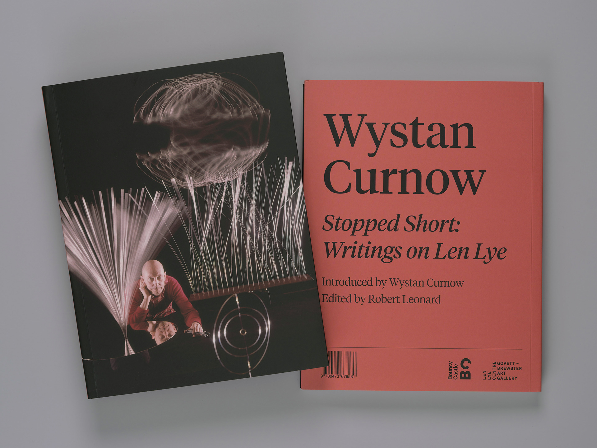
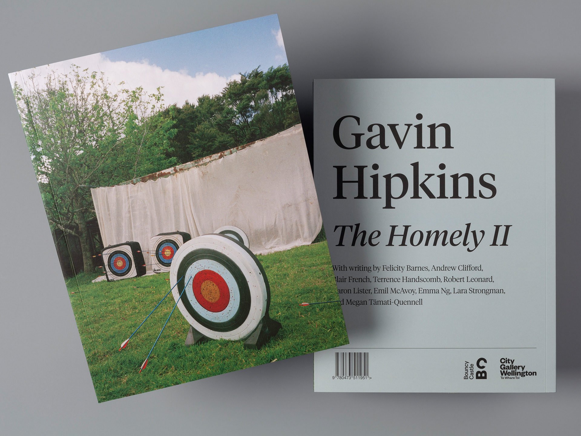
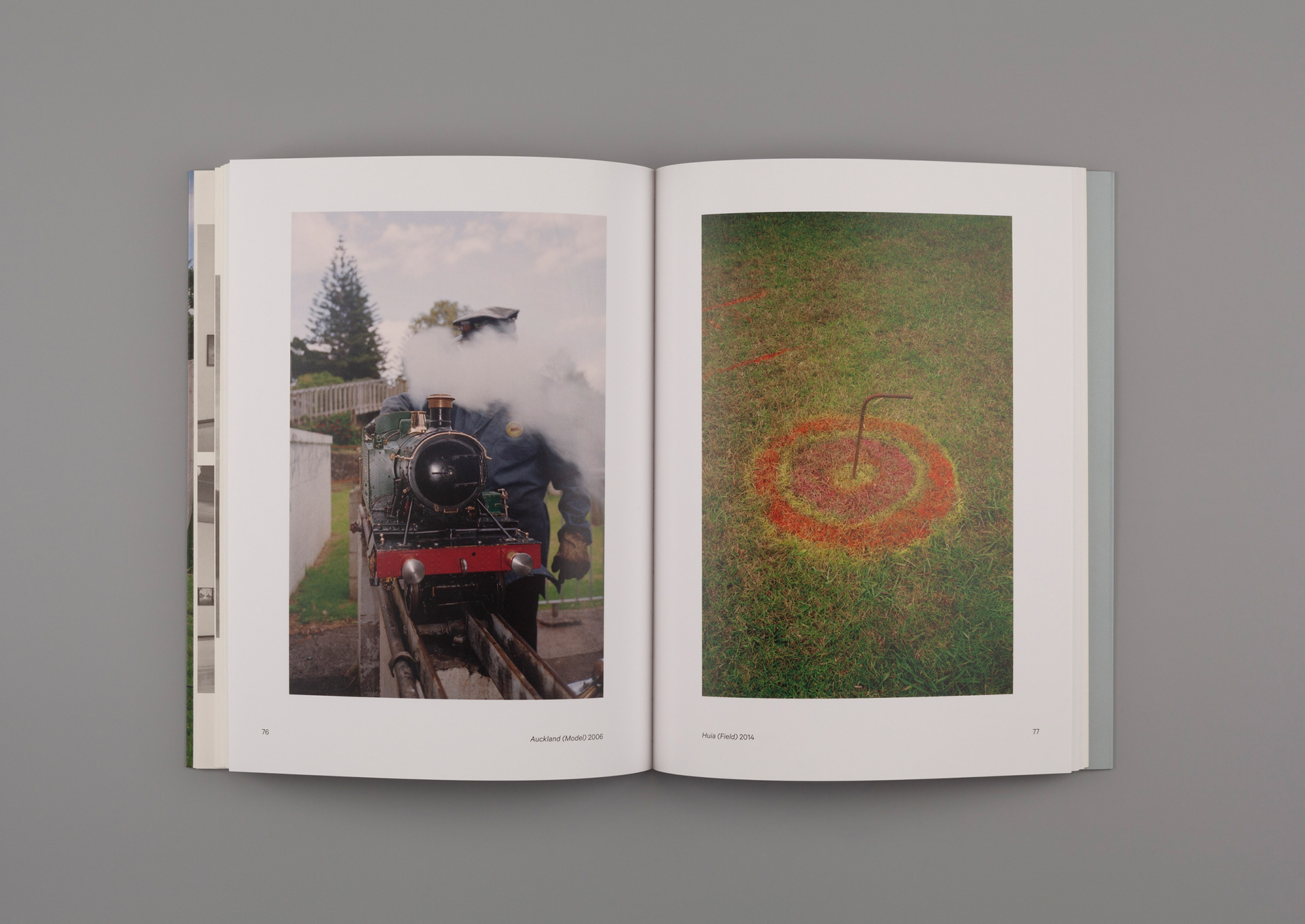
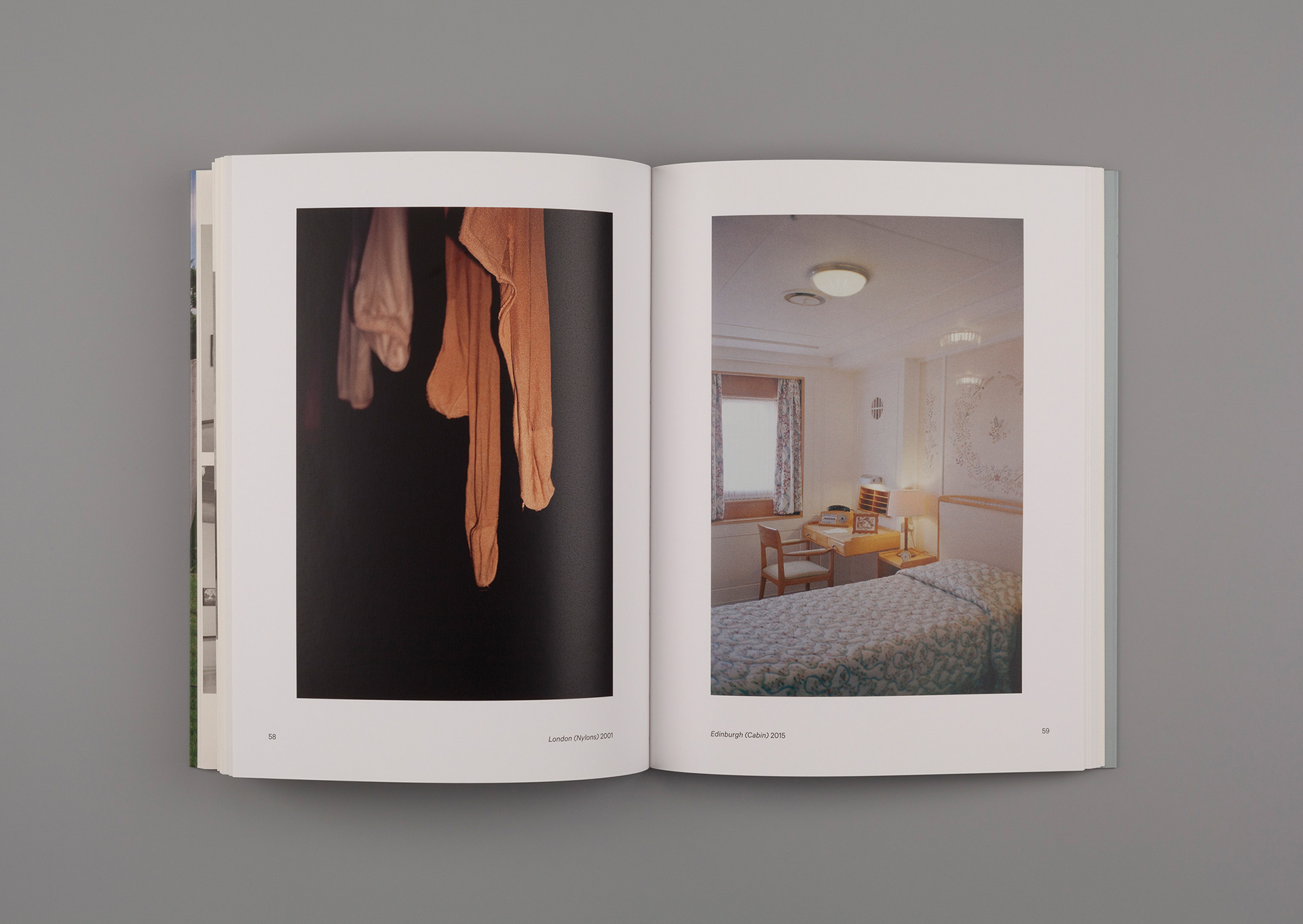
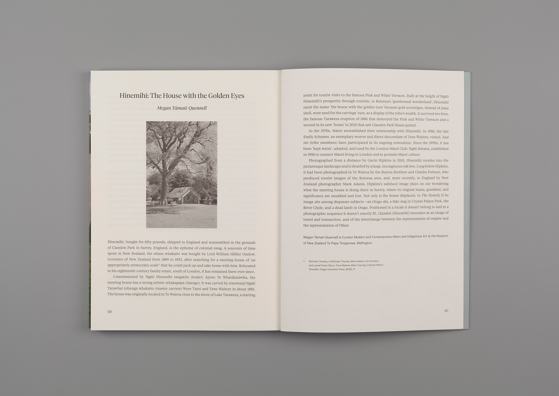
Bouncy Castle publish books on their own and in partnership. Their first title—The Homely II, documenting an epic photographic project by the Auckland artist and filmmaker Gavin Hipkins—includes essays long and short, and an interview with the artist. It was co-published with City Gallery Wellington. The subsequent title, Clinic of Phantasms, is a collection of the late Giovanni Intra’s art writings. Published in partnership with renowned Los Angeles publisher Semiotext(e). The third in the series—Wystan Curnow: Stopped Short: Writings on Len Lye was published for Govett-Brewster Art Gallery.
For their books, Bouncy Castle required a distinctive templated design system and a simple, cost-effective tohu/mark, which over time would become a signature look.
Response
The tohu: The flippant name Bouncy Castle might seem to contradict the imprint’s intent. We adopted the oxymoron ‘serious fun’ as a design guide. We wanted the tohu to be an integrated part of the design system, so built it with a typeface that could be used within the book. Klim Type Foundry’s Calibre was chosen as a serious font that with a little encouragement could also look playful. Turning the ‘B’ on its back and placing the ‘C’ directly above it, and titling it, created the illusion of bouncing—and a perfect, simple monogram for book spines. The full tohu adds the wordmark turned on its end—looking like a small typographic castle. There are no set colourways for the tohu, other than being mostly black or white over a colour ground.
The tohu: The flippant name Bouncy Castle might seem to contradict the imprint’s intent. We adopted the oxymoron ‘serious fun’ as a design guide. We wanted the tohu to be an integrated part of the design system, so built it with a typeface that could be used within the book. Klim Type Foundry’s Calibre was chosen as a serious font that with a little encouragement could also look playful. Turning the ‘B’ on its back and placing the ‘C’ directly above it, and titling it, created the illusion of bouncing—and a perfect, simple monogram for book spines. The full tohu adds the wordmark turned on its end—looking like a small typographic castle. There are no set colourways for the tohu, other than being mostly black or white over a colour ground.
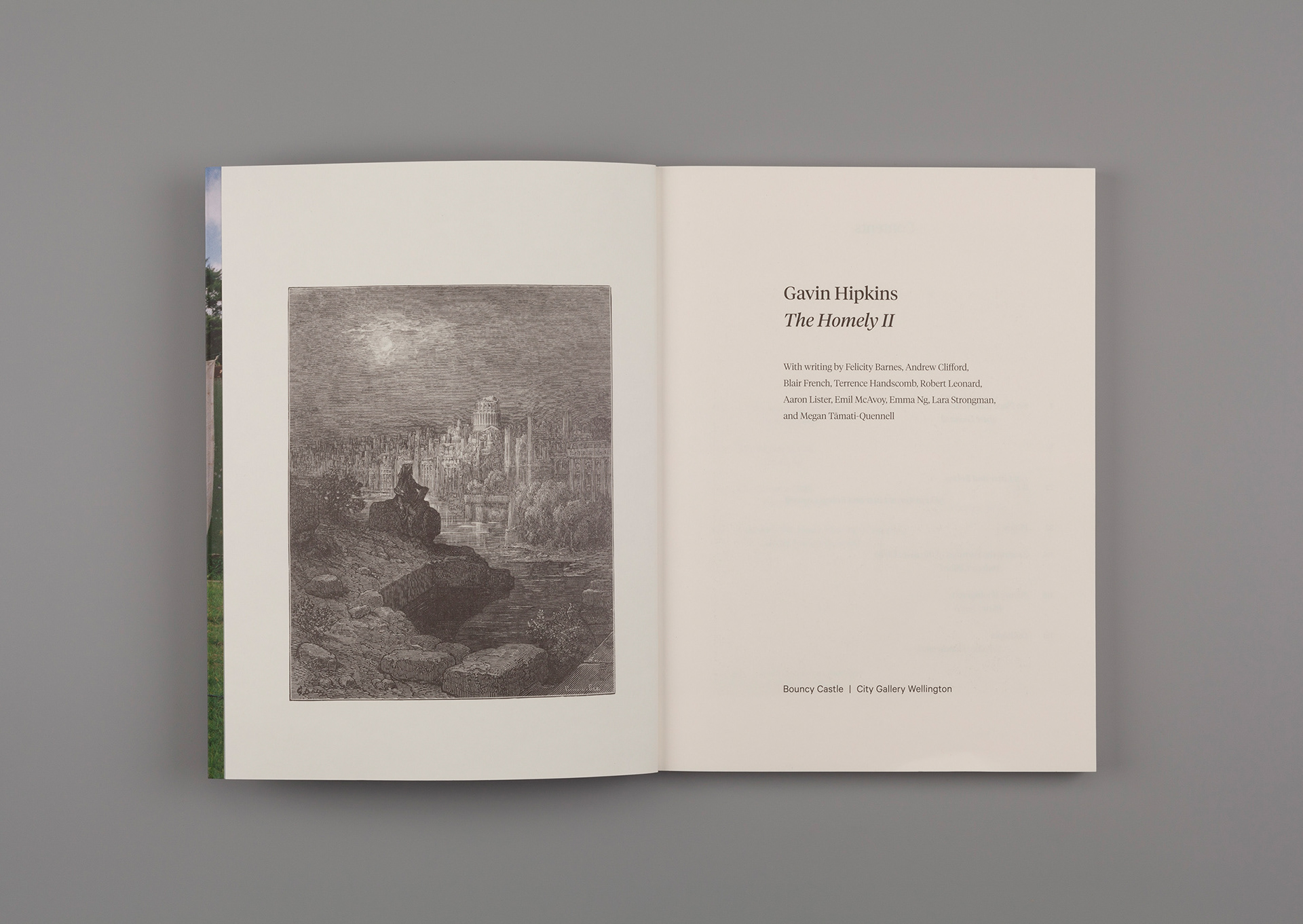
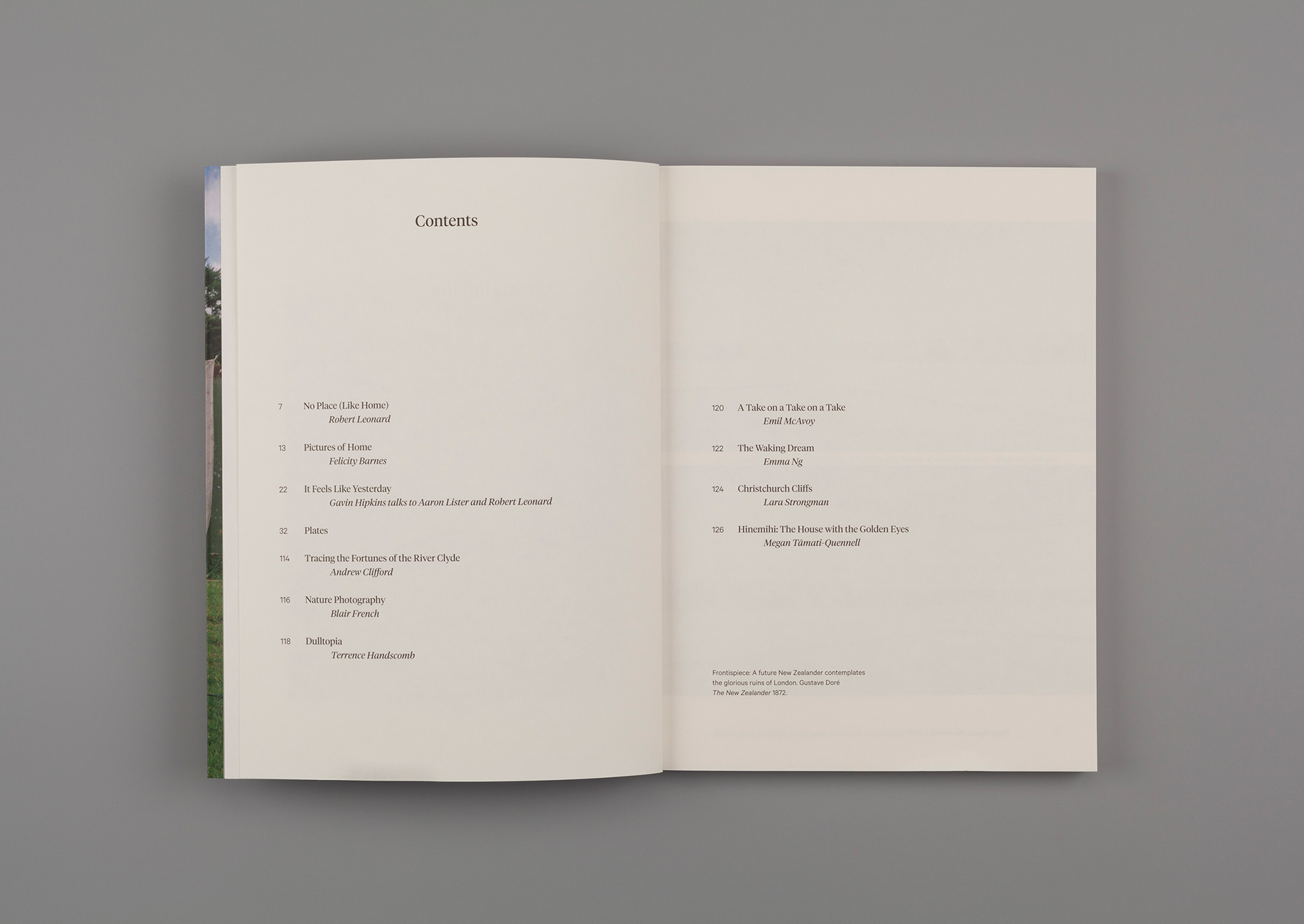
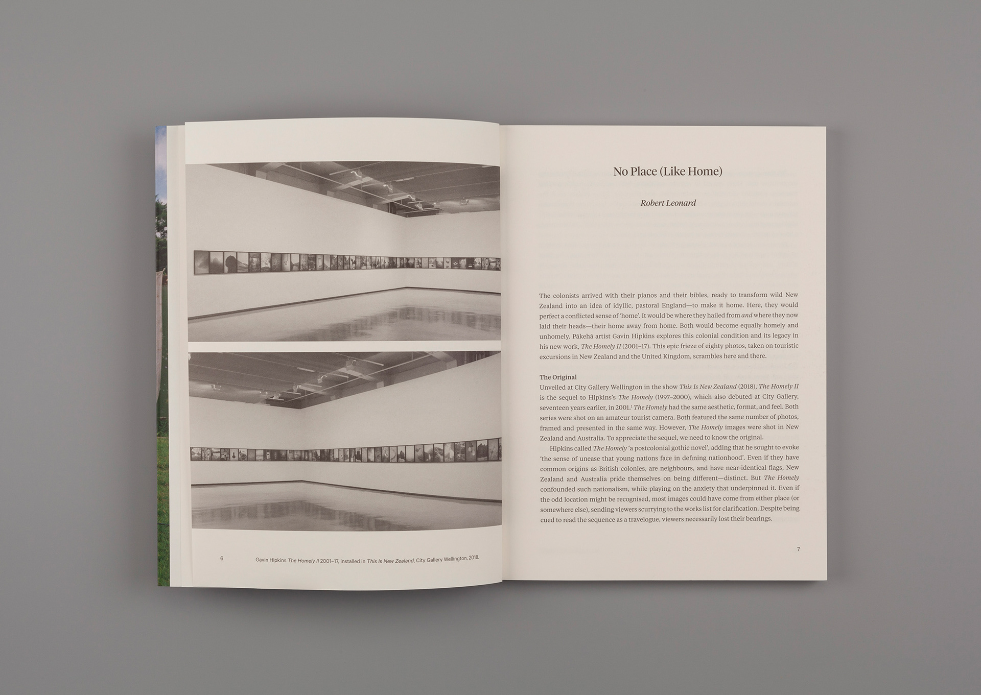
The books: A templated design system was developed to significantly reduce design and production costs. There is one book format and a standard but flexible layout grid system. Typography is largely set, but will grow with the challenge of each new project. We returned to Klim for the book’s primary typography—choosing the Tiempos family. This beautifully readable serif font offered text and headline styles, allowing it to be used large on the cover and economically inside. It pairs perfectly with Calibre—used for captions and endmatter. Uncoated paper stock was chosen for the text and coated for the plates.
The book cover: We wanted a distinctive and memorable approach, putting artists and artworks to the fore. This was achieved by having full-bleed images on the front cover, and running titles and authors in large type on the back. Colours will be used as a point of difference, with the the colour changing for each title. A consistent tint is used over the spine, back cover, and flaps.
Bouncy Castle was a finalist in the Small Brand Identity/Cultural and Editorial categories of the 2021 Best Design Awards