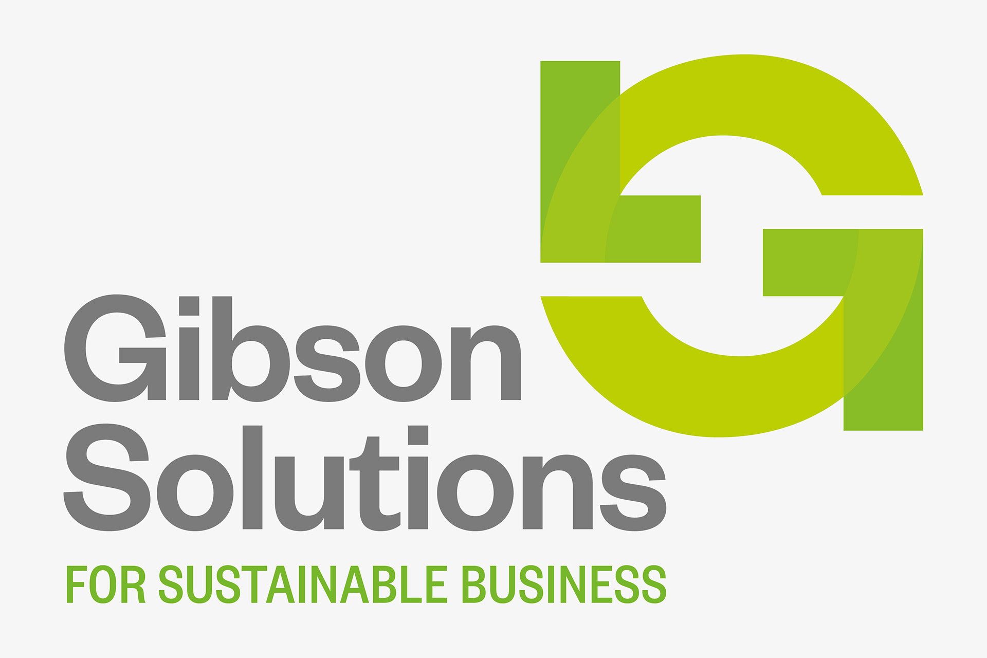
Gibson Solutions is a company providing sustainable business advice and health and safety management systems, training, and reviews.
The brand brings together two recognisable forms into a single icon that can be simultaneously read as the sustainable arrow icon or a signature ‘G’, in a clever visual play. A green and grey colourway is used to signify core attributes of Gibson Solutions – sustainability, neutrality and balance. In the primary icon, a palette of colours and transparency have been used to give the brand a dynamic contemporary presence. The position of the icon relative to the type block imbues the brand with a cantilevered dynamic energy. The typography is contemporary, clear and self-assured.