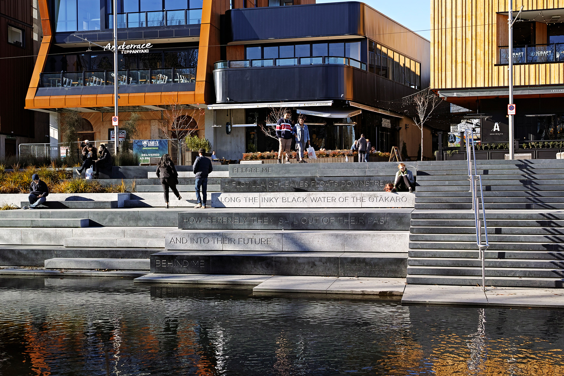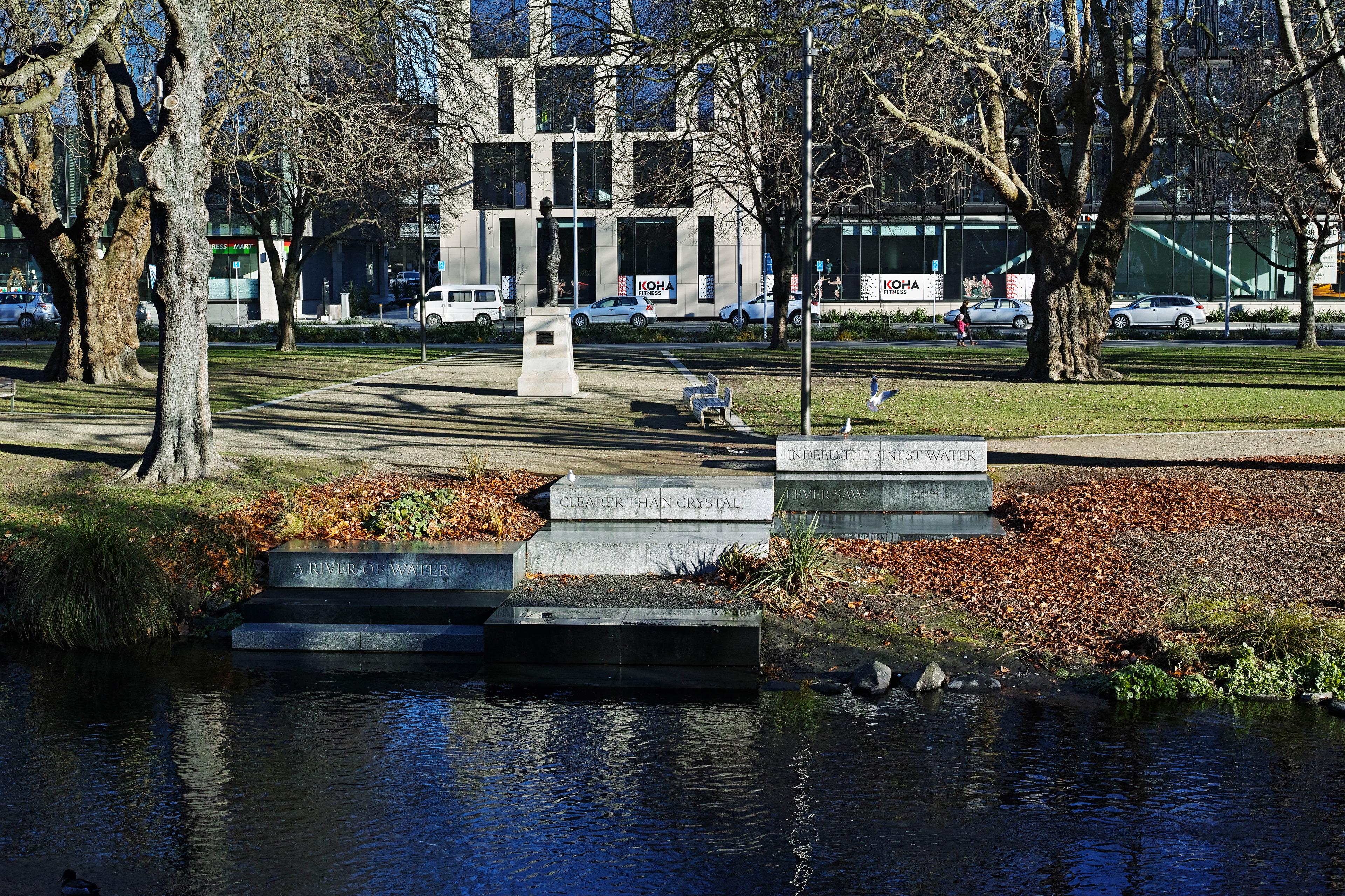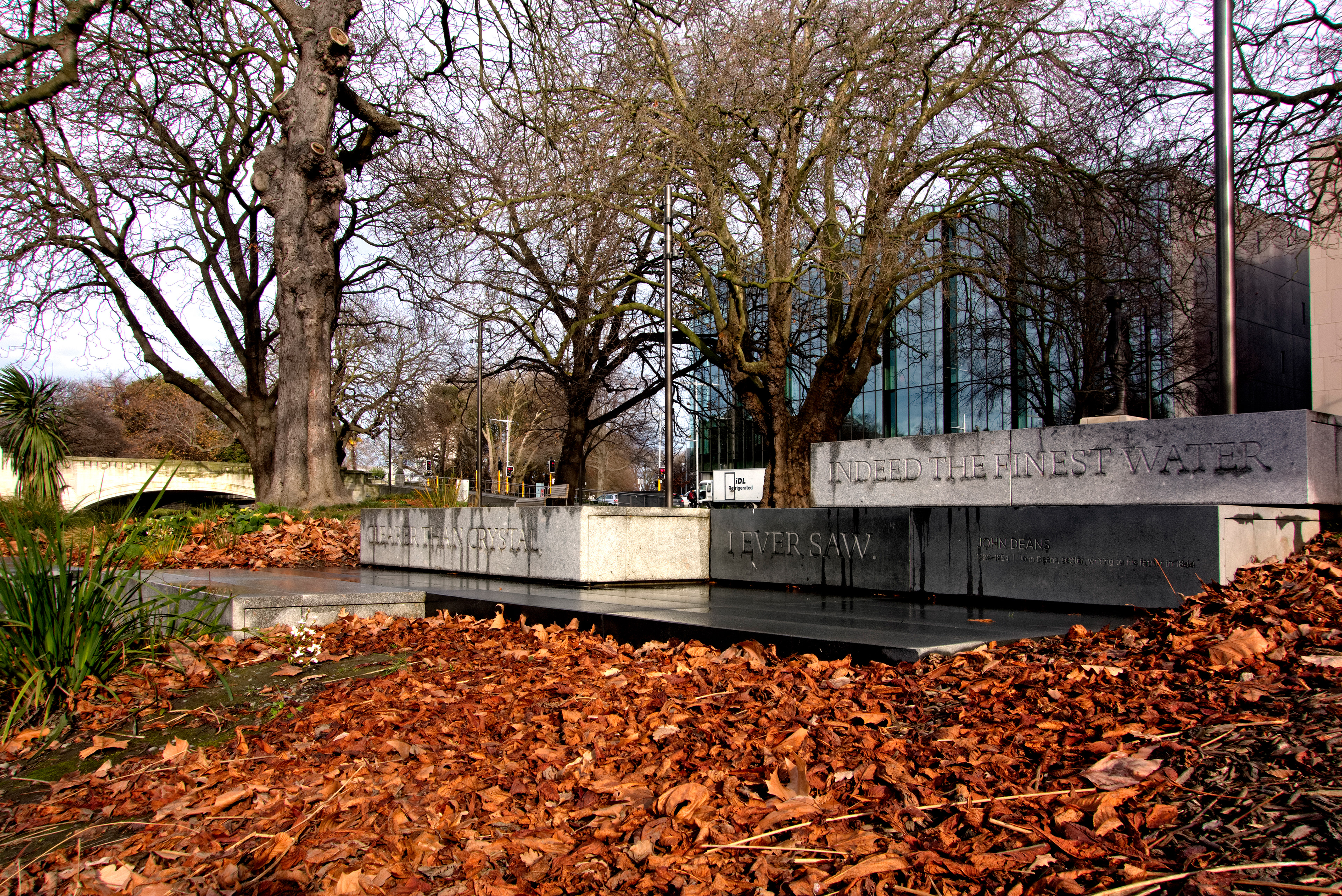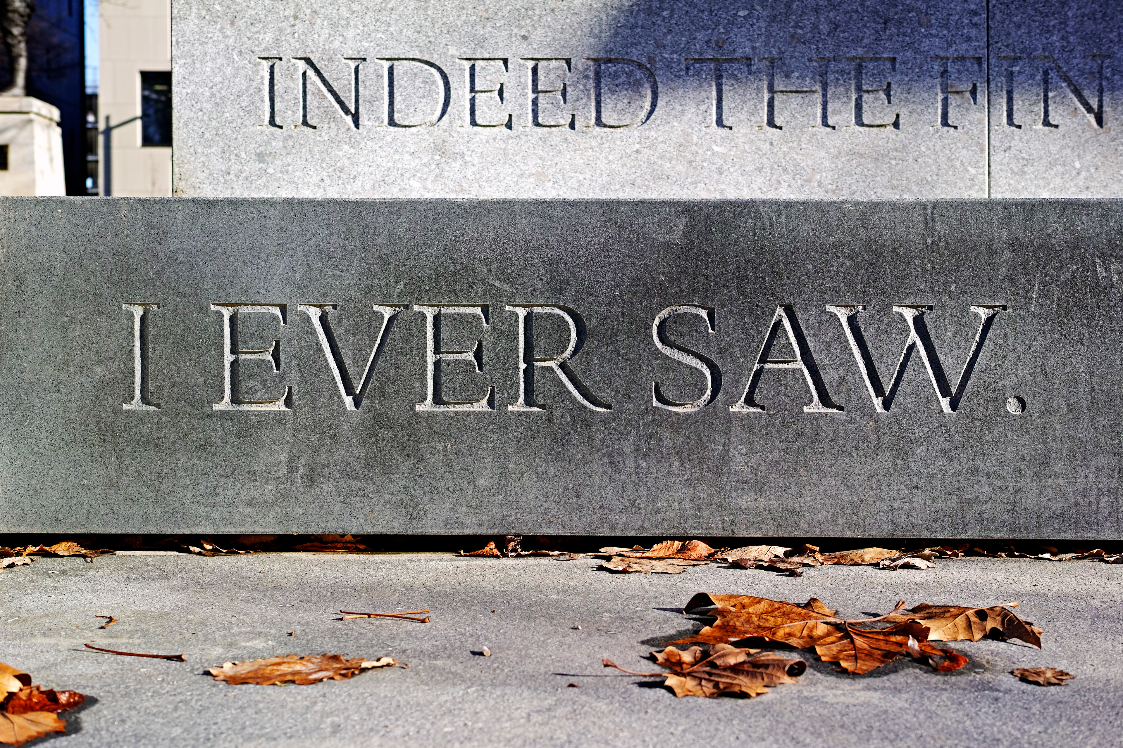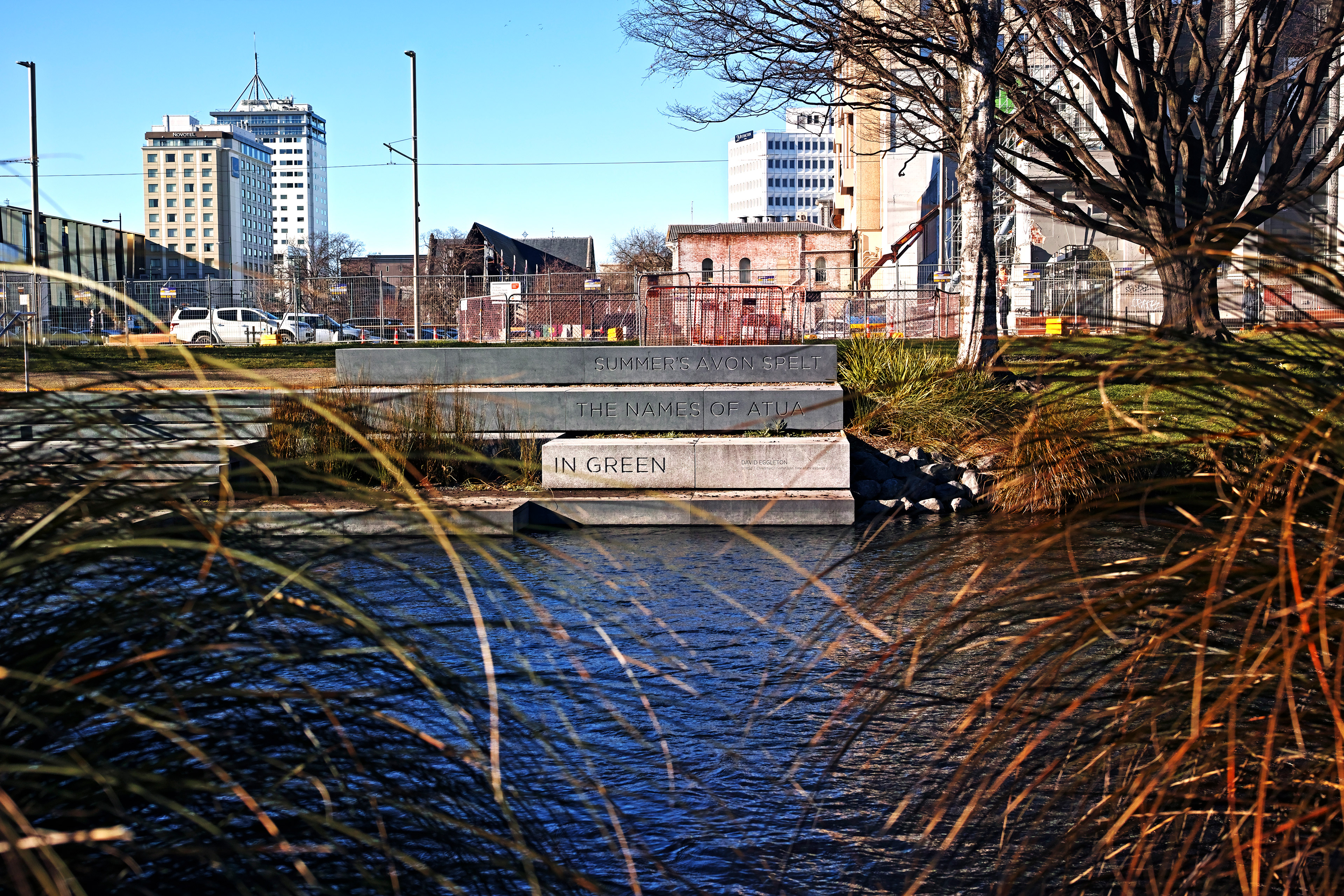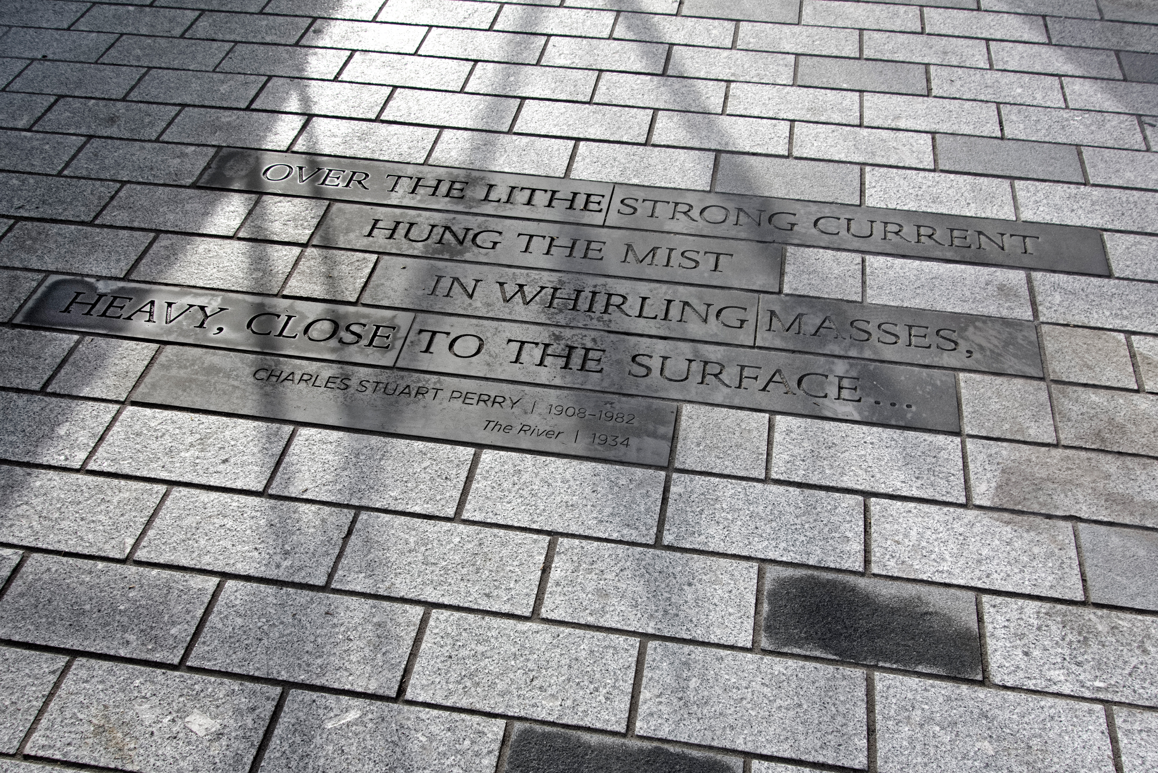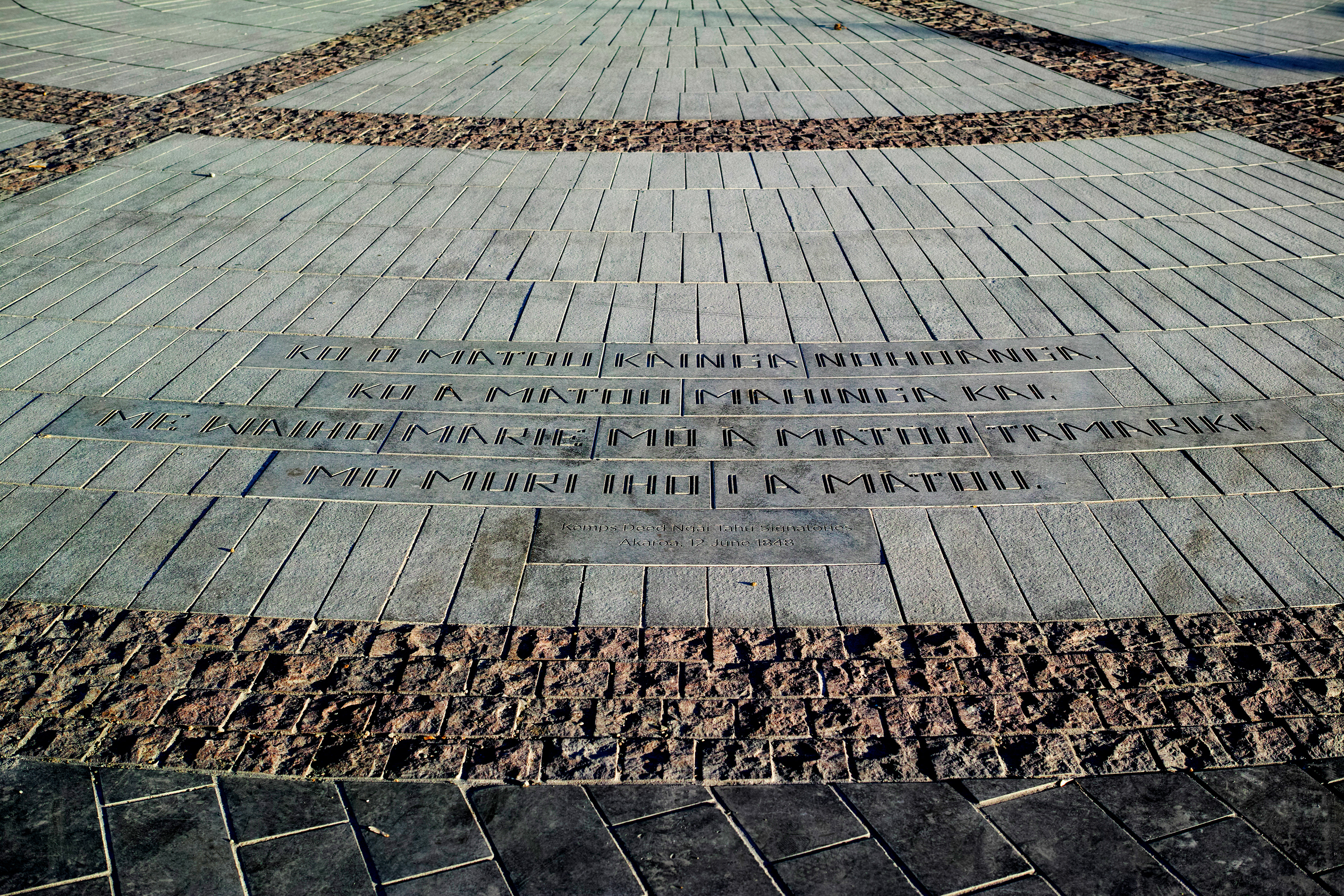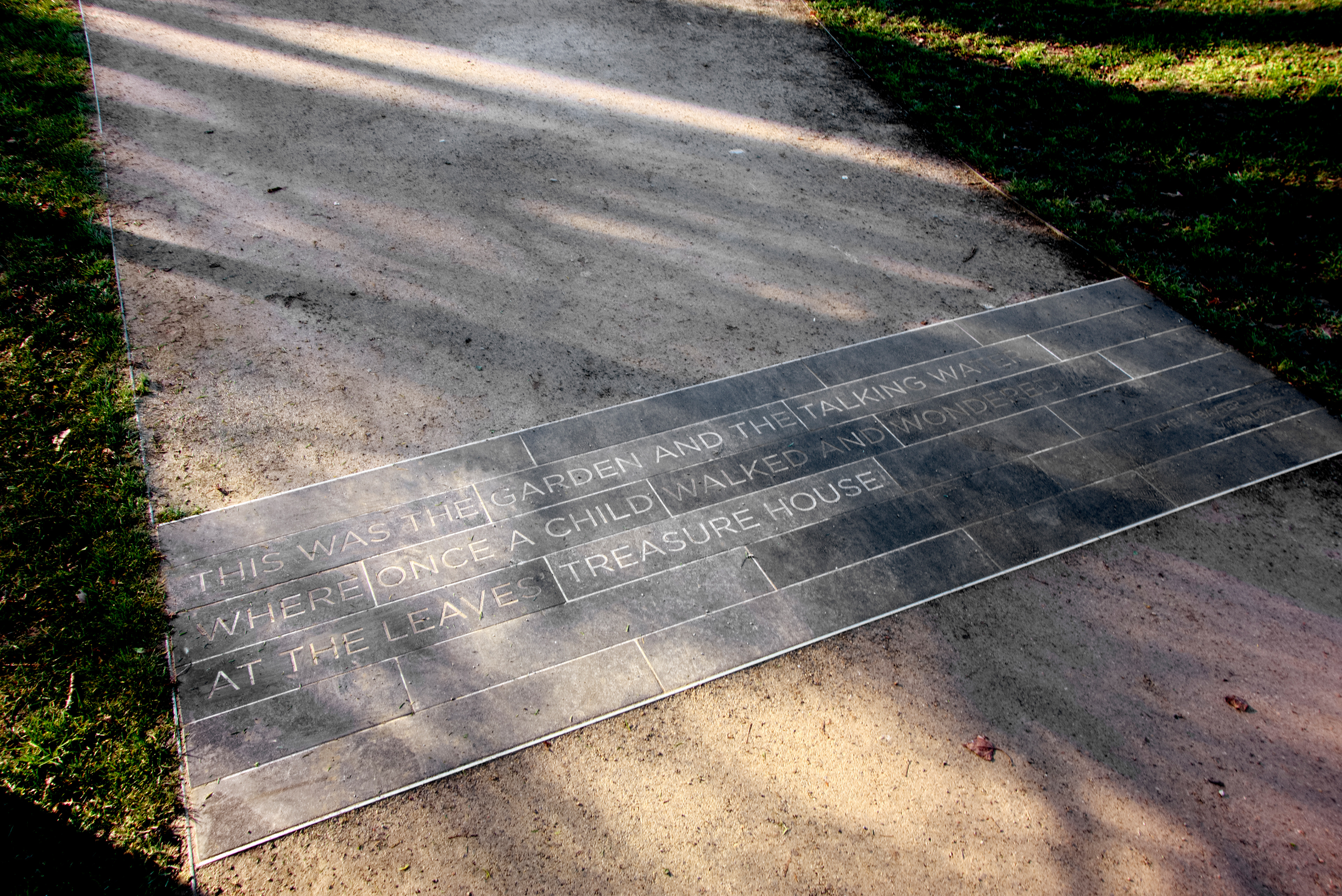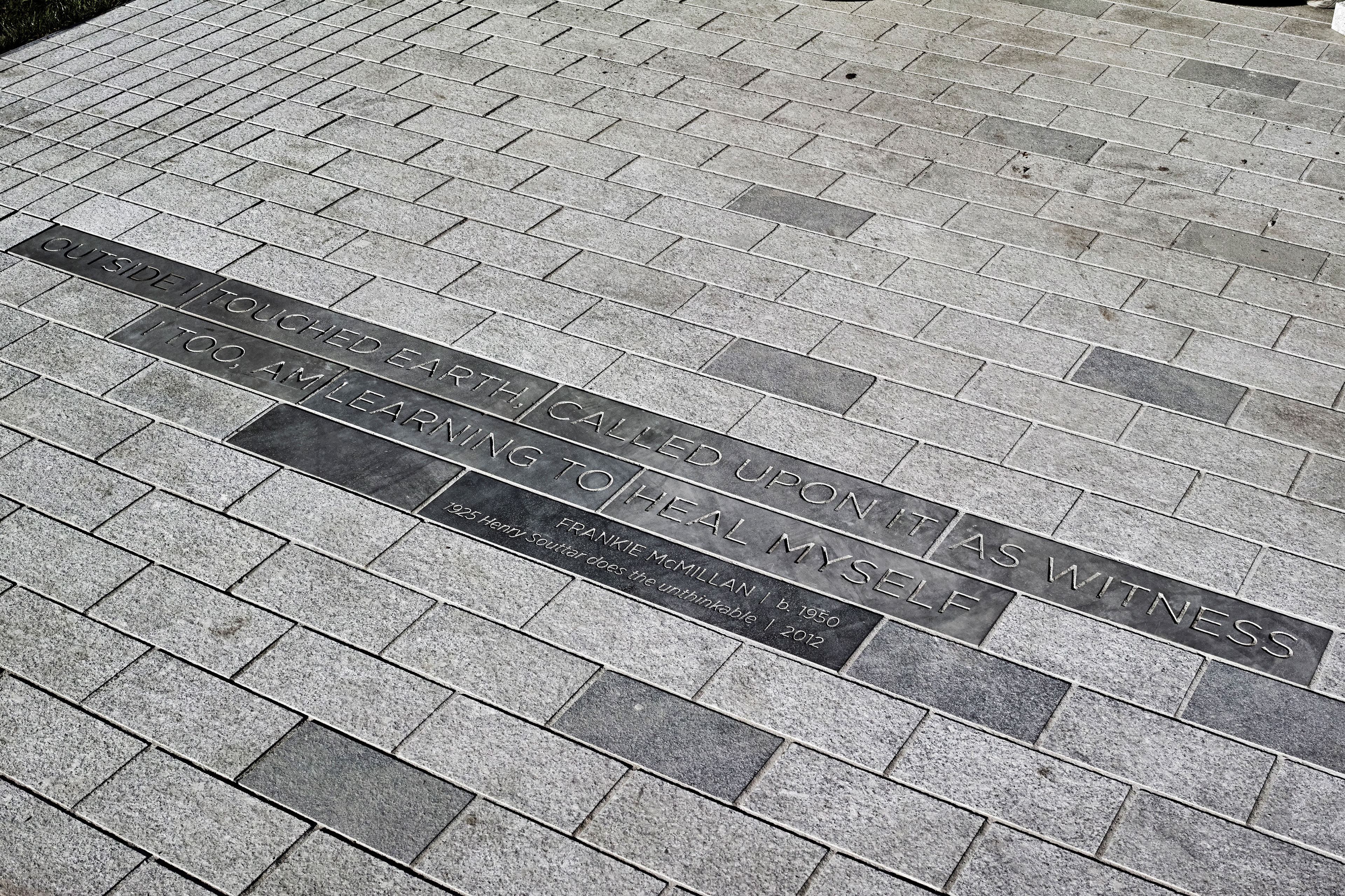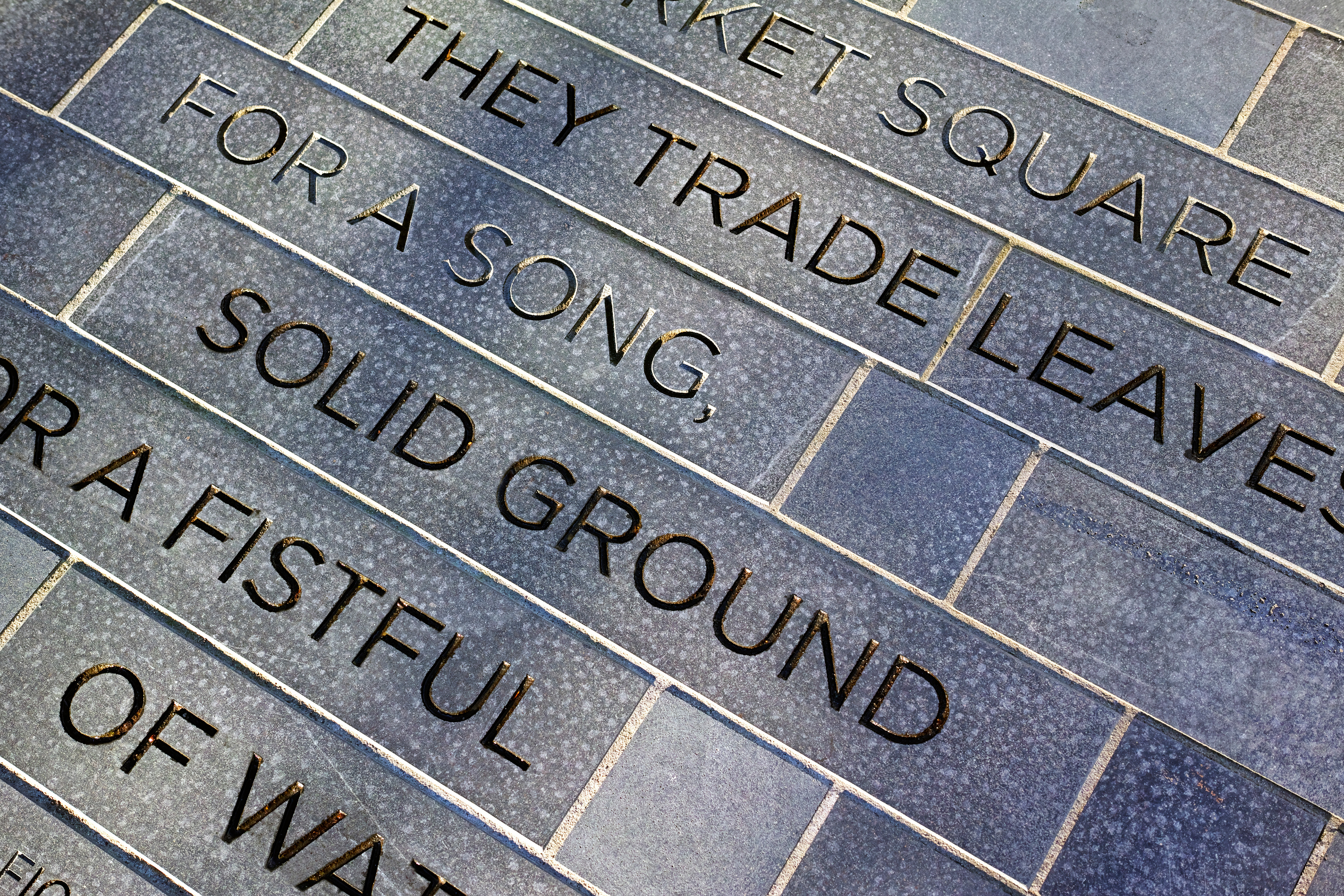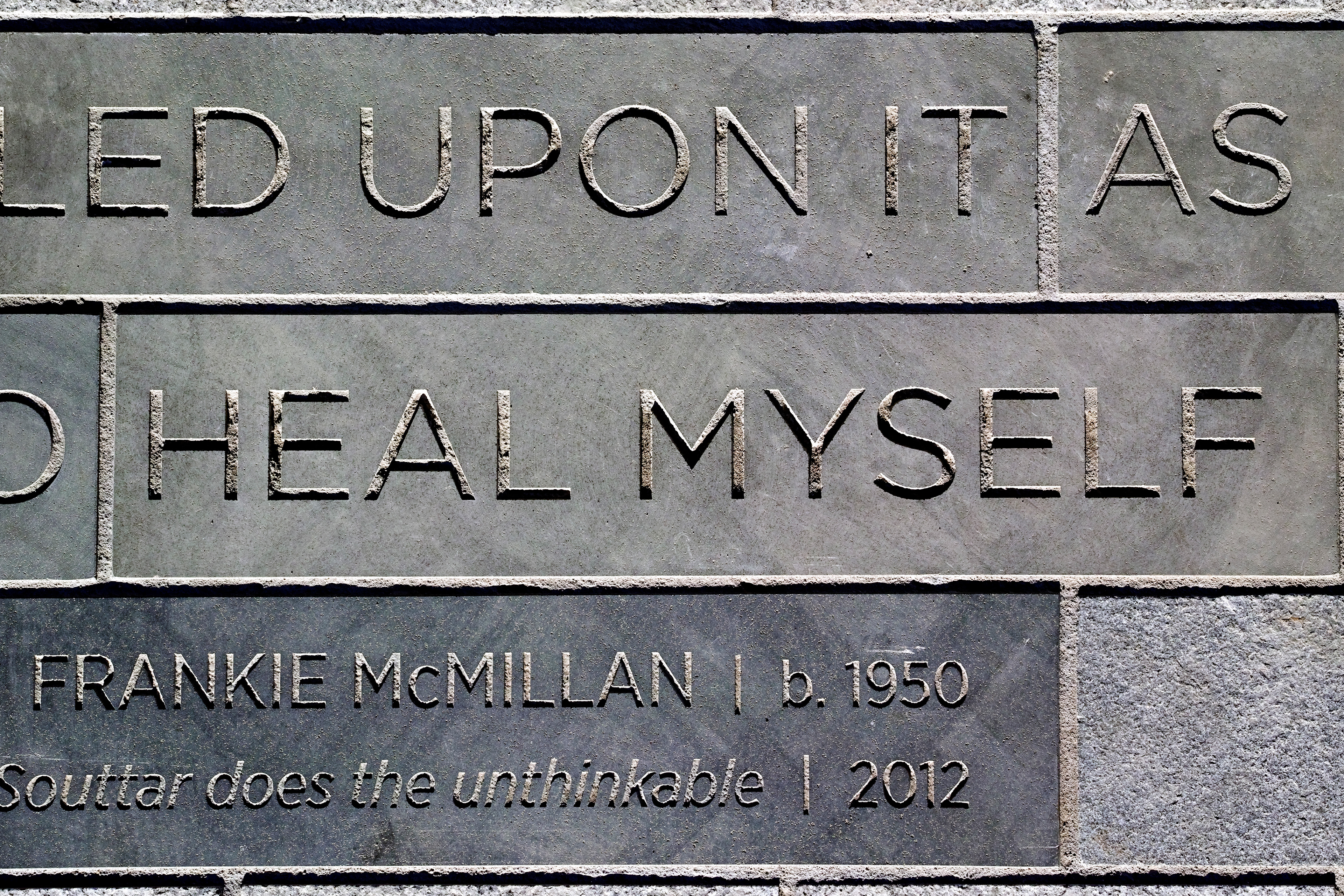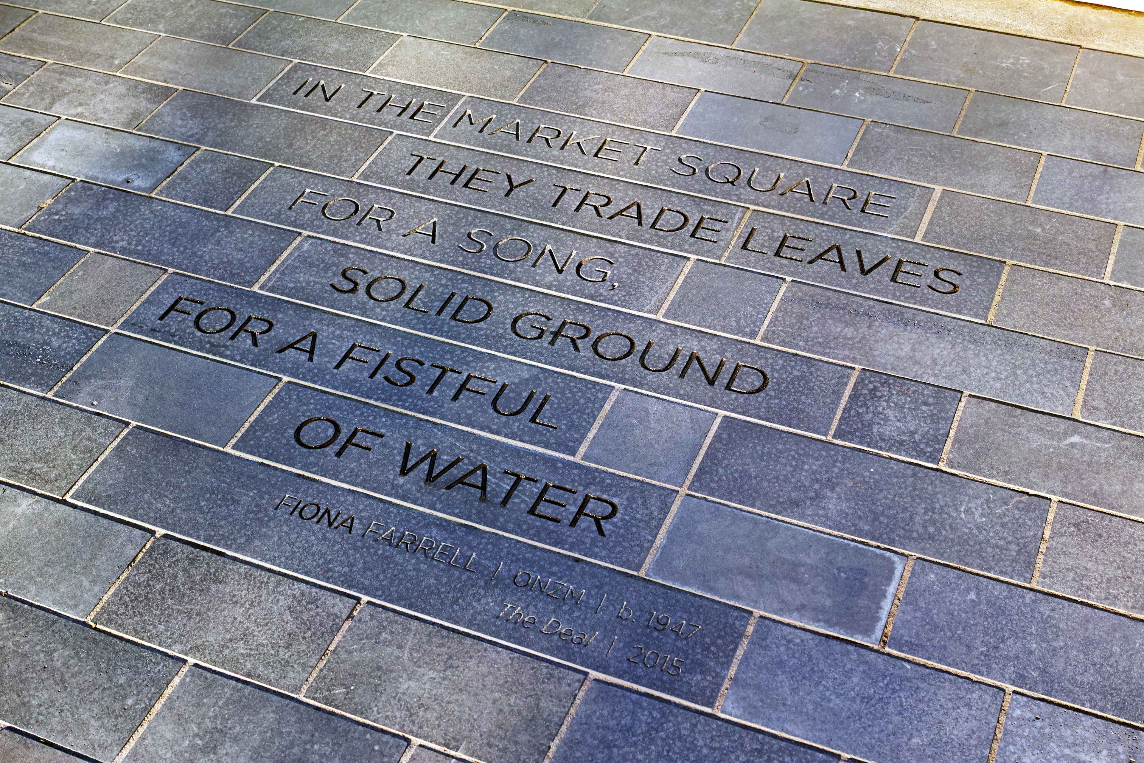
The Literary Trail is a feature of the Ōtākaro/Avon river redevelopment, with texts significant to Christchurch and the Canterbury Region integrated into the precinct landscape architecture.
One of the aspirations for central city anchor projects is to recognise Te Rūnanga o Ngāi Tahu heritage and places of significance. We worked closely with Matapopore, the mana whenua voice in regeneration to ensure Ngāi Tūāhuriri/Ngāi Tahu values, aspirations and narratives were realised in the project.
The principal Ngāi Tūāhuriri value for the Christchurch Anchor Projects is: Kia atawhai ki te iwi – Care for the people.
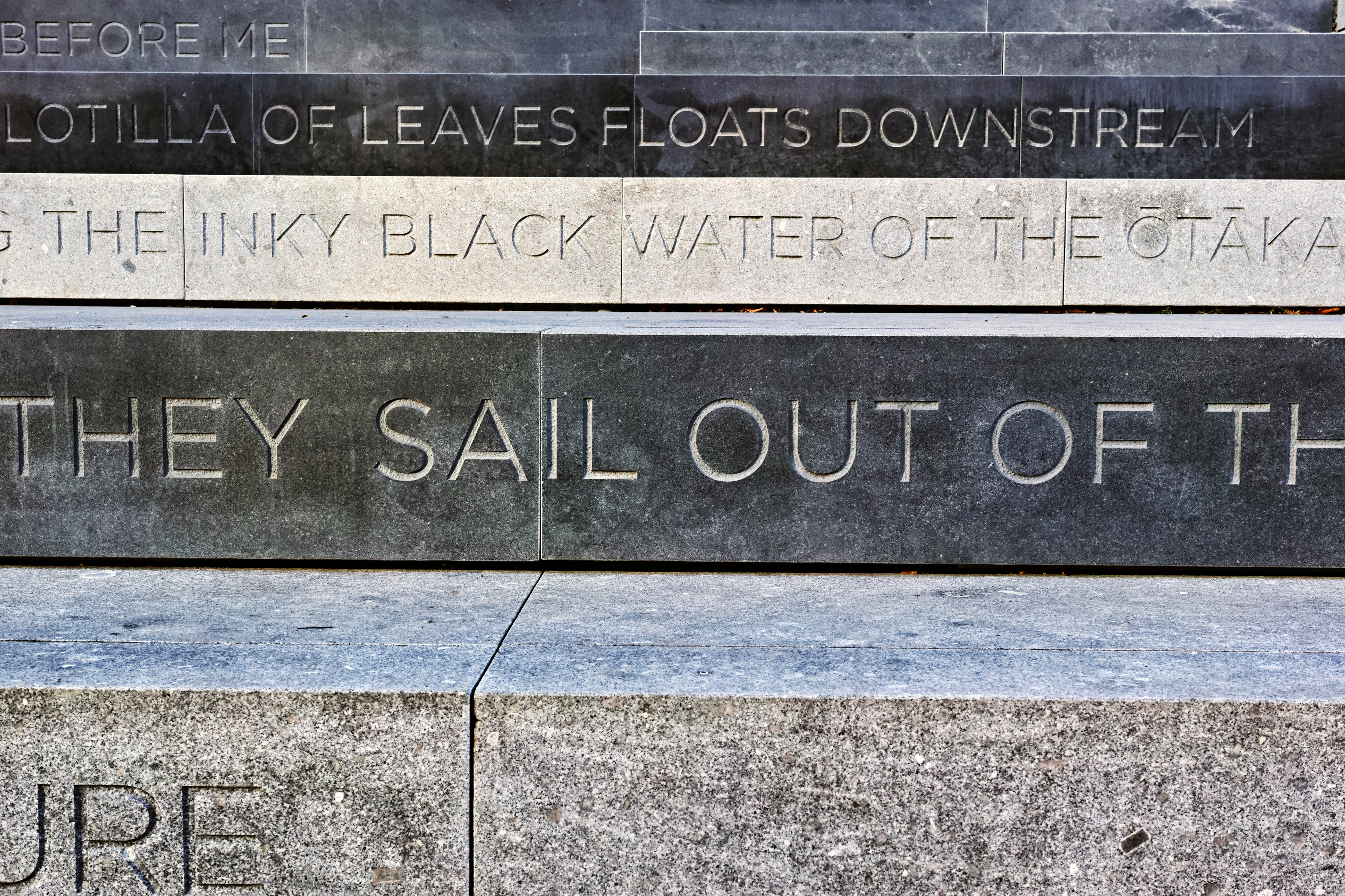
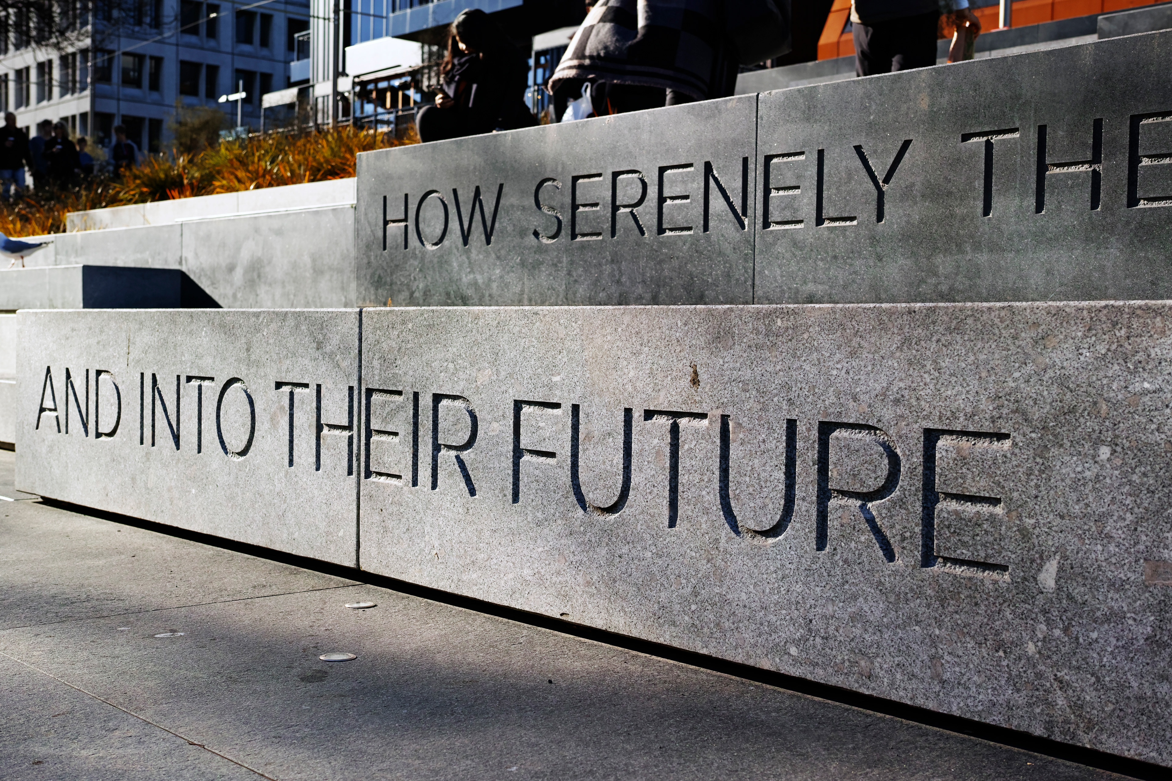
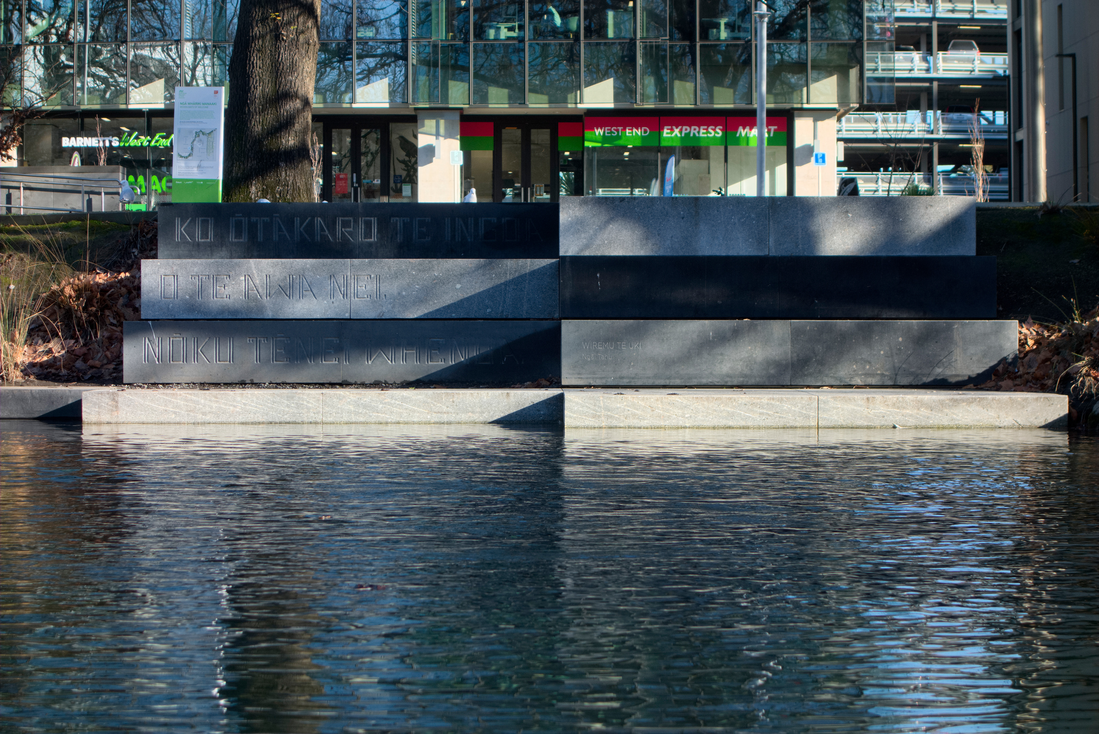
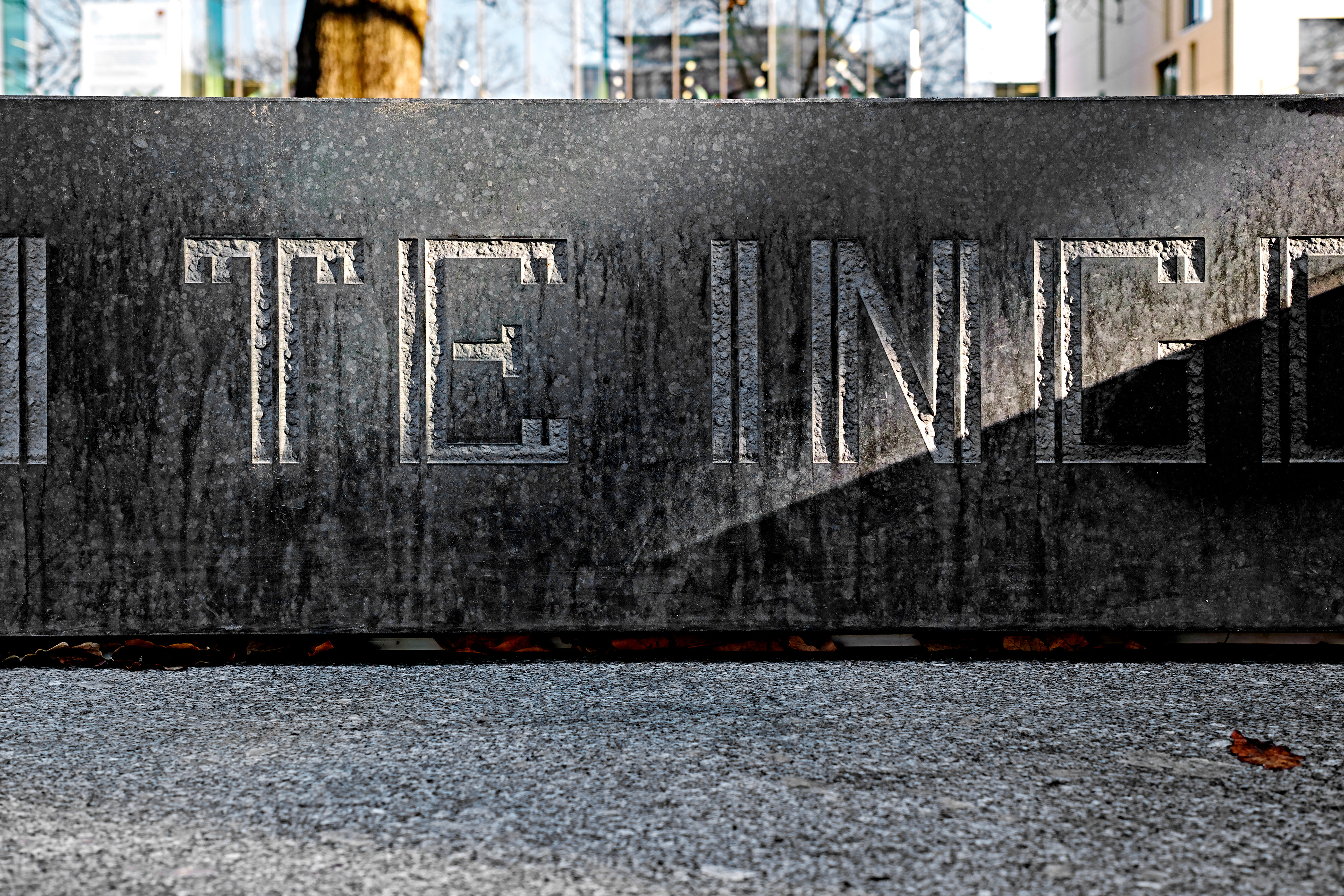
The works, sandblasted into the natural stone bleachers and paving, display quotes and pepeha by significant New Zealand poets and writers J K Baxter, Auntie Rima Bell, Allen Curnow, John Deans, David Eggleton, Herewini Eli & Wi Pokuku, Fiona Farrell, Bernadette Hall, Pita Te Hori, Kemps Deed Ngāi Tahu Signatories, Frankie McMillan, Apirana Taylor, Wiremu Te Uki.
Great care was taken with the siting of each work to ensure a strong relationship between the text and site.
The typography direction followed cultural and site-specific research.
The use of the written word and typography by Ngāi Tahu and other iwi was investigated to provide direction for the pepeha panels. Maps, whakapapa, legal documents, treaty signatures, rock art, naming of whare, text within carving and weaving traditions all informed the design.
The English language texts were inspired by traditions in publishing alongside existing architectural typography in Christchurch which strongly reflected Neoclassical and Arts and Crafts traditions – a reflection of the architectural fashions of times of the buildings’ construction.
We felt that the poems, like the texts on the buildings, would be best presented in a form that reflected the time they were written in – so it was decided that both a contemporary and historic approach to the typography was warranted.
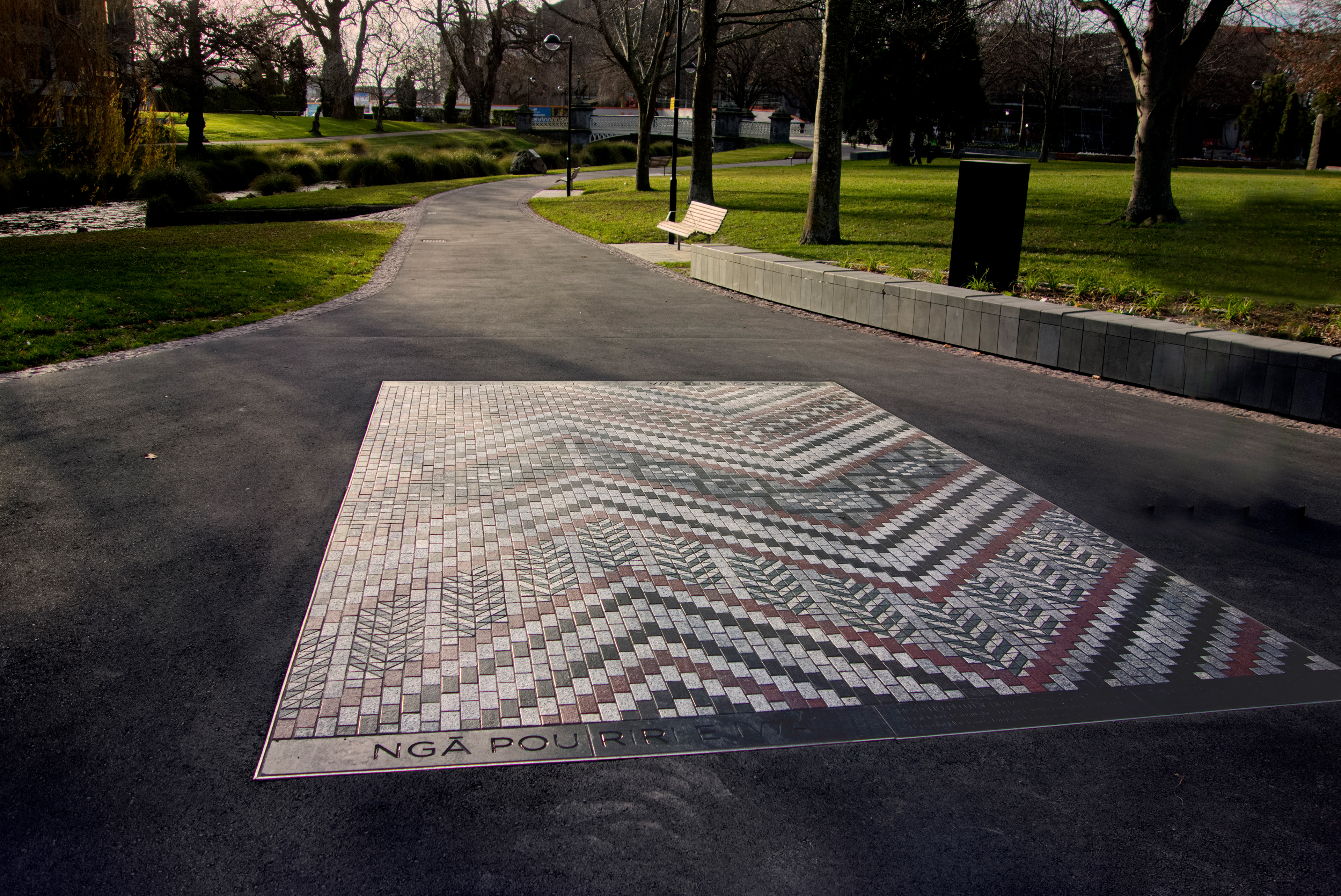
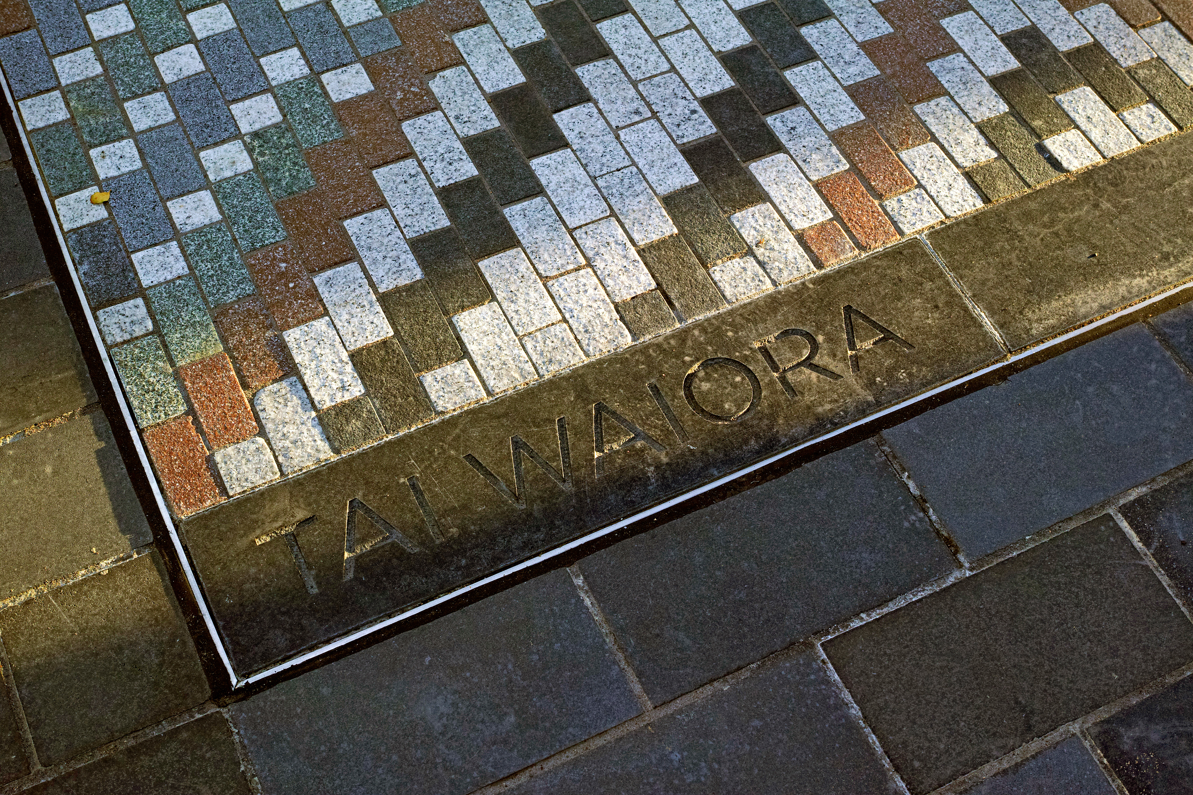
A traditional serifed font was chosen for 19th century texts, and sans serif for 20th and 21st century works. A bespoke typeface inspired by Ngāi Tahu visual traditions was designed for the te reo Māori pepeha. The hard-edged form of the typeface is designed to compliment the Nga Whariki paving works by Ngāi Tahu weavers that sit nearby, while the inline design pays tribute to Ngāi Tahu rock art traditions.
Te Papa Ōtākaro/Avon River Precinct Literary Trail received a bronze pin in the 2018 Best Design Awards.